Jackie spent the afternoon going through them on a light table, and then handed me 20 that she wanted to have scanned for a book she is writing on her family.
All have been very poorly stored, badly handled, and so are not in the best condition. I wasn't really sure what to expect, but I must say that at the end of the exercise I was presently surprised at how they turned out. These images weren't taken by a professional photographer (that I'm aware of anyway), and the exposures were all over the place. However, the level of detail and final product I was able to achieve through even basic enhancements in Photoshop, was pleasing.
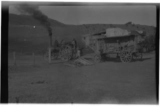
 Above is an original scan of a medium format (8x6cm) black and white negative. I have no idea of the camera or film used, but as you can see, the initial result wasn't much to write home about.
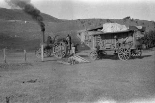
 Opening up the 'Levels' in Photoshop and moving the left and right sliders inwards to create a real black and white has helped tremendously. Far more than I thought it would, in fact. It's not brilliant, but it's a heck of a lot better, and more like we would expect a well exposed image to look.
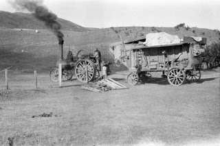
 The photo still wasn't quite punchy enough for me, so I also opened the 'Brightness/Contrast' control and gave the scan both a brightness and contrast boost. Normally I wouldn't suggest using brightness/contrast in Photoshop, as the results aren't particularly subtle and detail tends to get lost. However, in CS3 the Brightness/Contrast control has had a huge makeover, and now I used it all the time. The engineers have managed to keep the very basic slider setup, but have also allowed it to be used more subtly - without blowing out highlights or blocking up shadows. Brilliant. (Just don't tick the "Use legacy" box or you'll get the horrible old Photoshop results).
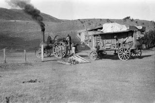
 Finally, I gave the image a slight 'Curves' adjustment, fixed up some of the spots using the 'Clone' tool, and used a moderate 'Unsharp Mask' setting (Amount 150, Radius .5, Threshold 0) and viola - finished photo.
Ok, so it's not going to win too many awards. But look where we started from, and where we ended up, and you've got to say it's a vast improvement. Yes, I could have spent a lot more time tweaking all sorts of other controls in Photoshop - but I had a lot of these to do in a small space of time, and so I was looking for a quick - but pleasing - result that would give Jackie most bang for her buck.
And just to round out the technical information (for those of you who care), the negatives were scanned on an Epson V700 Flatbed Photo scanner, at a dpi of 1200, which gave a final image size of 'roughly' 30cm x 20cm at 300dpi.
No comments:
Post a Comment
Thanks for your reply. I really appreciate you taking the time to comment on this post. I will get back to you as soon as I can.
Thanks again
Wayne